NYC Subway Diagram Map Poster
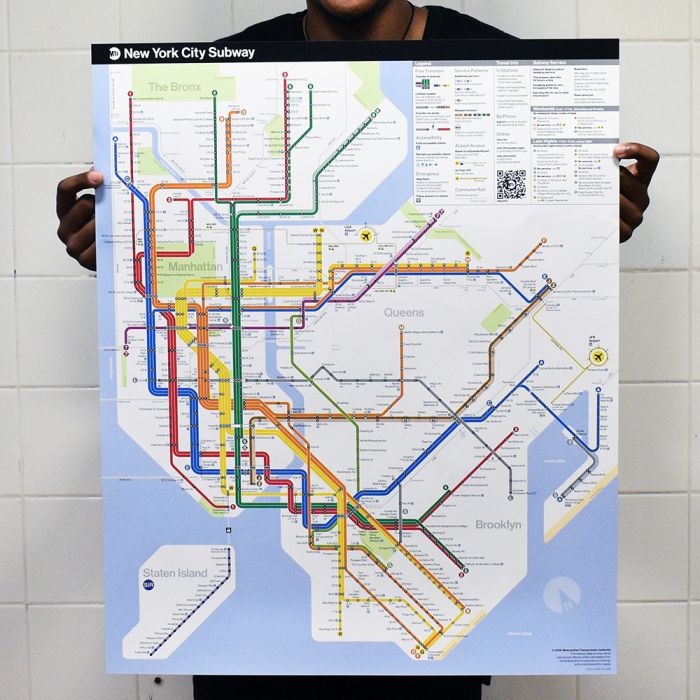
On April 2, 2025, the Metropolitan Transportation Authority (MTA) unveiled a reimagined subway map, its first new design since 1979. The new map, which draws from previous versions, simplifies riders' primary wayfinding asset while providing the most essential travel information in an easily readable, bright, bold, and orderly manner.
The new map was designed by the MTA’s Creative Services Mapping Department and, like many major subway systems around the world, utilizes a diagrammatic style, employing bold, straight lines making it much easier for the eye to follow and more suitable for digital users. The white background, bold colors, horizontal writing and use of black dots make the map more ADA-friendly and easier for people with low-vision or cognitive disabilities to read.Designers also focused on text legibility, keeping text on one line wherever possible and making better use of open space to alleviate crowding and using a black subway bullet with a white character to provide maximum contrast for easier reading.
The legend on the map is now more detailed and includes accessibility, transfer, and safety information, as well as a QR code that leads users to the MTA website.
Although this map is a new design, the creative team drew inspiration from previous maps including:
- Preserving the official brand colors established by the 1979 and 1998 Hertz maps
- Using a similar geometric and diagrammatic aesthetic introduced to the New York City Subway with the 1972 Vignelli diagram and revived by its successors, Waterhouse Cifuentes
In stock
Description / NYC Subway Diagram Map Poster
On April 2, 2025, the Metropolitan Transportation Authority (MTA) unveiled a reimagined subway map, its first new design since 1979. The new map, which draws from previous versions, simplifies riders' primary wayfinding asset while providing the most essential travel information in an easily readable, bright, bold, and orderly manner.
The new map was designed by the MTA’s Creative Services Mapping Department and, like many major subway systems around the world, utilizes a diagrammatic style, employing bold, straight lines making it much easier for the eye to follow and more suitable for digital users. The white background, bold colors, horizontal writing and use of black dots make the map more ADA-friendly and easier for people with low-vision or cognitive disabilities to read.Designers also focused on text legibility, keeping text on one line wherever possible and making better use of open space to alleviate crowding and using a black subway bullet with a white character to provide maximum contrast for easier reading.
The legend on the map is now more detailed and includes accessibility, transfer, and safety information, as well as a QR code that leads users to the MTA website.
Although this map is a new design, the creative team drew inspiration from previous maps including:
- Preserving the official brand colors established by the 1979 and 1998 Hertz maps
- Using a similar geometric and diagrammatic aesthetic introduced to the New York City Subway with the 1972 Vignelli diagram and revived by its successors, Waterhouse Cifuentes
What's The Story
| Released in 2025, the new map was designed by the MTA’s Creative Services Mapping Department and, like many major subway systems around the world, utilizes a diagrammatic style, employing bold, straight lines making it much easier for the eye to follow and more suitable for digital users. The white background, bold colors, horizontal writing and use of black dots make the map more ADA-friendly and easier for people with low-vision or cognitive disabilities to read. |